Blaugust 06+07: Booru gallery tweaks
I'm having fun with my booru! I'm slowly uploading art, along with the help of some of the friends I made private accounts for. I'm also uploading art as people remind me that it exists and they want to see it - see this message I got today about if I've ever drawn Venture Brothers fanart. Oh boy do I.
The booru works well out of the box, I just have to make a couple of tweaks for my own tastes and for mobile view.
Getting started
Although I can't override the css or php on my side, Shimmie1) has a click-n-install plugin for altering the <head> of every page. So that immediately got me thinking I should upload my own css file to override whatever I need.
Steps to enable custom headers:
- Go to system>extension manager> check “Custom HTML Headers”
- Go to system>board config
- Scroll down to “Custom HTML Headers”
- Paste your desired HTML.
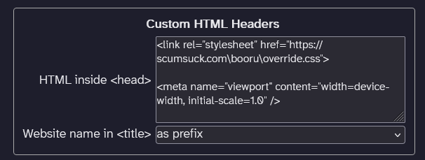
Here's what that section looks like:
Viewport: In my case, I noticed that by default the viewport isn't set. So if you browse on a phone screen, it will be zoomed out and the text n' images will be tiny. I just copy/pasted the exact code from that w3schools link above, and that fixed the problem immediately.
<meta name="viewport" content="width=device-width, initial-scale=1.0" />
Stylesheet override: I also pasted in the stylesheet I want to use in the header. In my case, I hosted it on my personal site, and I'm hotlinking it to this site (even though they're on different hosts :P).
<link rel="stylesheet" href="https://scumsuck.com/booru/override.css">
That way, I can edit things on my end, and use my VScodium→git workflow to automatically update the booru's styling along with my main site.
Favicon: I haven't done this yet, but I could probably also update the favicon on my end. I initially had to bother Kat about uploading the favicon, but doing it myself would be nice cuz I often see tiny little mistakes in the pixels that I want to fix 50x before I'm satisfied lol.
CSS grid layout
Now with the stylesheet ready, I could dig in and fiddle with the styling for my own tastes.
First and foremost, the “blotter” news plugin was displaying on the very bottom of the site. Even though I had set it to appear on top. It was also clipping all the text together into an unreadable mess.


First easiest fix was the clipping issues. As a little baby noobie, my first order of business was inspecting the element, and enabling/disabling all the checkboxes until it changes the way it looks. Seemed like everything in the blotter was set to position:absolute, which makes them stack on top of the same central point (in this case, the lower left corner). I had to do the ugly looking !important thingy after changing the position to position:relative to get the changes to stick2), but it worked! I also did some text re-alignment and teeny margin/padding adjustments.
#blotter1 span {
  position: relative !important;
  text-align: left !important;
}

#blotter1 {
  position: relative;
  margin: 1em;
  font-size: 90%;
  line-height: 1em;
  display: flex;
  flex-direction: column;
  gap: 1em;
  grid-column: 1;
  grid-row: 2;
}

#blotter2 {
grid-column: 2;
  grid-row: 2;
  margin: 1em;
}
Now, what the hell is grid-column???
I'm used to typing up flexbox layouts for my own site, so I couldn't figure out what was controlling the order of sections. The actual HTML elements were typed up in the correct display order, so it had to be in the CSS. I've seen some layouts use order to re-order items in mobile layouts. But shimmie did not have that at first ctrl+f glance.
This led me to learning about grid-column and grid-row variables. The site is using grid as its layout, with certain things assigned in grid-row 1, 2, 3, etc . So that variable makes them appear on the first row of the site (like the header+menu) or the 2nd row (the gallery and sidebar tags((which are set to the first column with grid-column:1 while the gallery is set to grid-column:2, woah!), and so on. But the blotter wasn't assigned any row or column!! Oh no!!!!
So, the fix was to set the column and row numbers of the blotter section to row 2 (under the header), AND to increase the row number of everything after the header by one to compensate for that.
@media screen and (width <= 800px) {
HEADER {
    grid-column: 1;
  }

#blotter1 {
  grid-column: 1;}

#blotter2 {
  grid-column: 1;
  grid-row: 3;
}

ARTICLE {
  grid-column: 1;
  grid-row: 4;
}

NAV {
  grid-column: 1;
  grid-row: 5;
  padding: 0;
}

FOOTER {
  grid-column: 1;
  grid-row: 6;
}
So here's the fixed blotter appearing after the header, before the main content, and without all the words mushed together.
Cool. And this is how I learn best, by solving actual real problems that I have and want to fix. I haven't been able to really grasp CSS grid more complex than just making equal sized boxes for galleries. But this little thing helped me learn quite a bit about grid layouts, and got me thinking about how I can implement the same thing for my page! Seems very useful to re-order sections without having to copy/paste entire messy html snippets!
Tag spacing
Next thing that was bothering me, the mess of tags in the tag cloud section.
If you had more than one tag of the same “type”, like characters or series, they would bunch up with no spacing. I can't read that
The immediate issue I'd have to solve is that shimmie doesn't have very specific CSS classes for the tags, let alone most of the sections on the site that are re-used in multiple pages with different styling. Seems like the tags are just generated as an unordered, unstyled list from php or .js or something, and that's why they're all smushed together.
At first I tried adding margin-right:1em to the .tag class, but that made the tags on the image page look funky (because those had a , comma generated after each tag, so the margin would push the commas really far), and made the tags on the front page funky (because those are in a list column with a break inbetween each tag, and the tag count number would be pushed by the added margin). How do I target JUST the tags on the tag cloud page??
I would ordinarily add a class to that page that would only be used on that page. Like <body class=“tag-cloud”>. Or hell I'd just add Like class=“tag-cloud” to that specific usage of the tag cloud, but it just reuses the .blockbody tag that's used on every other page for everything from descriptions to metadata!!! But I don't have access to the PHP/HTML on my end, and I do NOT want to break the HTML anyways lmao.
So here's my fucked up and evil fix:
article > section > .blockbody > .tag {
  margin: 0 1em 1em 0;
  display: inline-flex;
}
I noticed that there was a specific order of nesting that the HTML had on each page. The '>' brackets will ONLY target the .tag if it appears in that specific sequence. And that specific nesting of article > section > .blockbody > .tag just happened to only appear on the tag cloud page! If it had appeared on any other page, I'd be fucked, but oh boy am I lucky that this worked!
I am aware that this is a fragile duct tape and super glue solution that will break if the software ever updates its HTML nesting. But this software styling hasn't been updated since like 2007. I'm just fixing up the antique toilet, gramps!
Font tweaks
There were a couple other things I did.
- Like use my preferred font Atkinson Hyperlegible Next as the body font. Atkinson's my favorite “accessibility” designed font, it's much easier for me to read than the other dyslexia font that's fat and skinny in weird places and lowkey looks like the Halloween Chiller font. And it's pretty cute and round. Most importantly, it differentiates characters like 0/O and 1/l a lot easier for my brain! Different people have different font preferences, this is my own preference.
- I also set the title font to Freckle Face! It matches this wiki, as well as my main site. It's free to use and redistribute. And it's a totally NOT SpongeBob font, despite the freckle name. Apparently it's designed after the Funny Face drink from the 60's that has some rather racist caricatures for cariactures! Coulda fooled me.
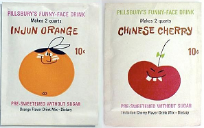
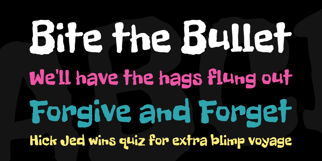

The SpongeBob cartoon is very intentionally crafted to have throwbacks to the era of Mr. Hillenburg's childhood in the 60's and 70's. So it makes sense that these typefaces would look similar. I wonder if there's any direct acknowledgement of Funny Face drinks in SpongeBob lore?
The End
That's it for now. I'm having a lot of fun organizing art on my booru, especially as a group effort, and asking my Dark Gathering of Autists what canon tags we should use. Maybe the next blogpost will be talking out loud about tagging and wording we like!
It's a lot more fun than copy/pasting HTML or just sucking images from a folder, I tell you what :P Gets me to re-engage with my art, look at the details, realize things… and force others to engage with it again even if I already posted it 5 years ago.
I'm done coloring that Saber/Sparkle crossover yuri, now to post it. In my commission down time, I need to get a head start on sticker club for August and send out the July stuff…. and of course make signs for Slutfest. Seeya.
Comment below to power my genkidama.
Please ignore the “real name” label, and type whatever you want in that input. Don't doxx yourself online!
You can enter an email if you want notifications on replies, or if you want to have an avatar on your post.



Comments
so glad you're having so much fun with this!!!! i'm really happy to provide this for you :)
(also i'll get back to you on your DM from earlier today i have been busy!)
I can't thank you enough for building these wonderful gay little sites for me to dick around in! The collab of the century… you gotta let me know whenever you want me to draw something for you so I can finish the trade-for-trade :D