
 Dale Gribble's Playlist
This is an old revision of the document!
astro attempt
- You have to install a bunch of shit - https://docs.astro.build/en/tutorial/1-setup/1/ I'm following this tutorial
- I already forgor how I installed it
- Opened up VS Codium
- Opened up terminal
- ran
npm create astro@latestas per tutorial - gave it a folder to build in ``Z:\sites\big-mountain-fudgecake``
- said yes to everything like installing dependencies and initializing git
- choose minimal theme
- ok the folder is created. open that in vscode
NEXT!! MAKING THE SITE
- run
npm run devin the terminal to preview your gay site - your site preview should be on
http://localhost:4321/` by default - find
src/pages/index.astroto edit your front page - edit it
- save
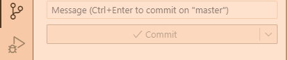
- use the git panel to upload to your github acct lol
- log into vercel to make a new page
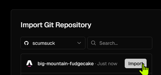
- deploy that gay shit
- link domain via porkbun…
- wait for it to generate SSL certificate
- ok it's live: https://fudgecak.scumsuck.com/
- make a new page in
pagescalledabout.astro - type some shit in there, copy/paste what was in
index.astro - Did the markdown tutorial i already know that
- on the "dynamic content" part so I can add their band roles…
- doing components so i can make the nav and footer
- blah blah i dont want a blog tags i just want the RSS using the blog as a RSS feed lol
- ok it works
- Skipping the shit about islands, going to the part abt light/dark themes
- uhh but i want to do the simple one click toggle with dark/light color-scheme meta…
- whatever I'll learn that later
- upload dat shit to git (i should get off github some time)
- it's up i guess https://fudgecak.scumsuck.com/about/


Stylize it tomorrow
Color toggle
I'm copying this guide: Setting And Persisting Color Scheme Preferences With CSS And A “Touch” Of JavaScript by Henry Bley-Vroman
I am specifically using this guide because it uses the default light/dark css themes that don't require any CSS, and allows the user to override it if they want to choose another theme.
I specifically want the ability to change background images, not just background color. I want the default mode to be “dark mode” so there's no “FART”1). And I want the ease-in-ease-out color transitions to be optional. So this is in my global.CSS:
:root {
  /* dark style, dark = default */
  color-scheme: var(--color-scheme, dark);
  --bg: url('/img/bg.jpg');
  transition-duration: 200ms;
  transition-property: background, background-color, color;

  /* page preference is "dark" */
  &:has(#color-scheme option[value="light"]:checked) {
    --color-scheme: light;
    /* any additional dark styles */
    --bg: url('/img/bg-light.jpg');
  }

  /* page preference is "system", and system preference is "dark" */
  @media (prefers-color-scheme: light) {
    &:has(#color-scheme option[value="system"]:checked) {
      --color-scheme: light;
      /* any additional dark styles, again */
    }
  }

 @media screen and (prefers-reduced-motion: reduce), (update: slow) {
    transition-duration: 0s;
  }
}
And this is in my Toggle.astro, which is contained in my SidebarLeft.astro component and makes up my navigation.
/*
 * If a color scheme preference was previously stored,
 * select the corresponding option in the color scheme preference UI
 * unless it is already selected.
 */
function restoreColorSchemePreference() {
  const colorScheme = localStorage.getItem(colorSchemeStorageItemName);

  if (!colorScheme) {
    return;
  }

  const option = colorSchemeSelectorEl.querySelector(`[value=${colorScheme}]`);

  if (!option) {
    localStorage.removeItem(colorSchemeStorageItemName);
    return;
  }

  if (option.selected) {
    return;
  }

  option.selected = true;
}

/*
 * Store an event target's value in localStorage under colorSchemeStorageItemName
 */
function storeColorSchemePreference({ target }) {
  const colorScheme = target.querySelector(":checked").value;
  localStorage.setItem(colorSchemeStorageItemName, colorScheme);
}

const colorSchemeStorageItemName = "preferredColorScheme";

const colorSchemeSelectorEl = document.querySelector("#color-scheme");

if (colorSchemeSelectorEl) {
  restoreColorSchemePreference();

  colorSchemeSelectorEl.addEventListener("input", storeColorSchemePreference);
}
Discussion
oooh thank you for this
yayyy glad my noob fumblings can help somehow :P